The Resource Utilization Dashboard helps project managers and team managers track individual team members’ workload, assigned tasks, planned vs. actual hours, and overall utilization trends. It provides a clear view of resource efficiency, helping optimize workload distribution and project planning.
Accessing the Resource Utilization Dashboard
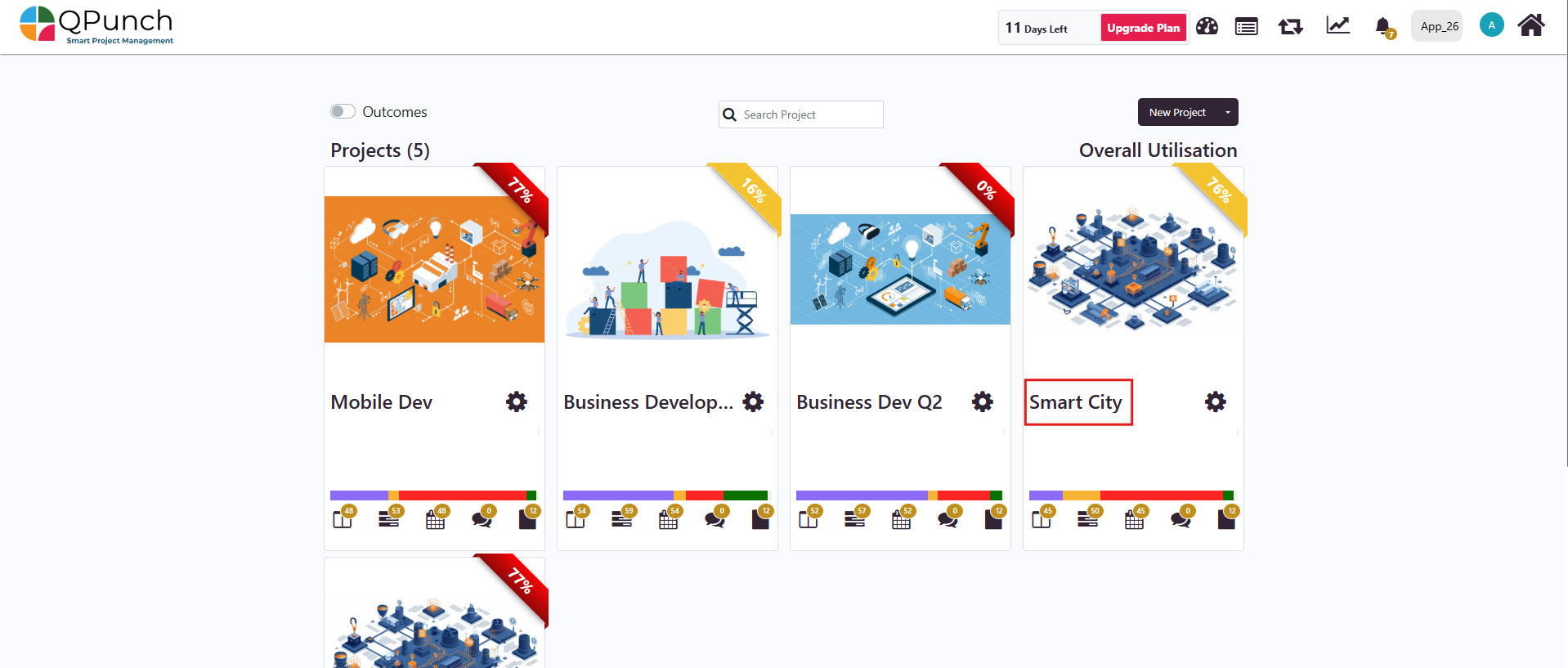
Step 1: From the home page, click on the project name you wish to access.
Step 2: Once inside the project dashboard, click on the Resource Dashboard tab.
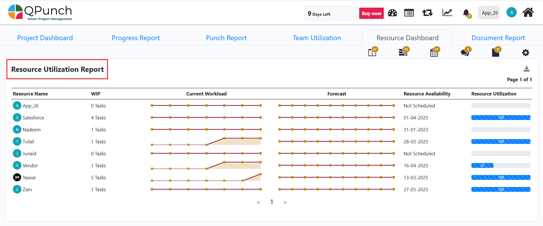
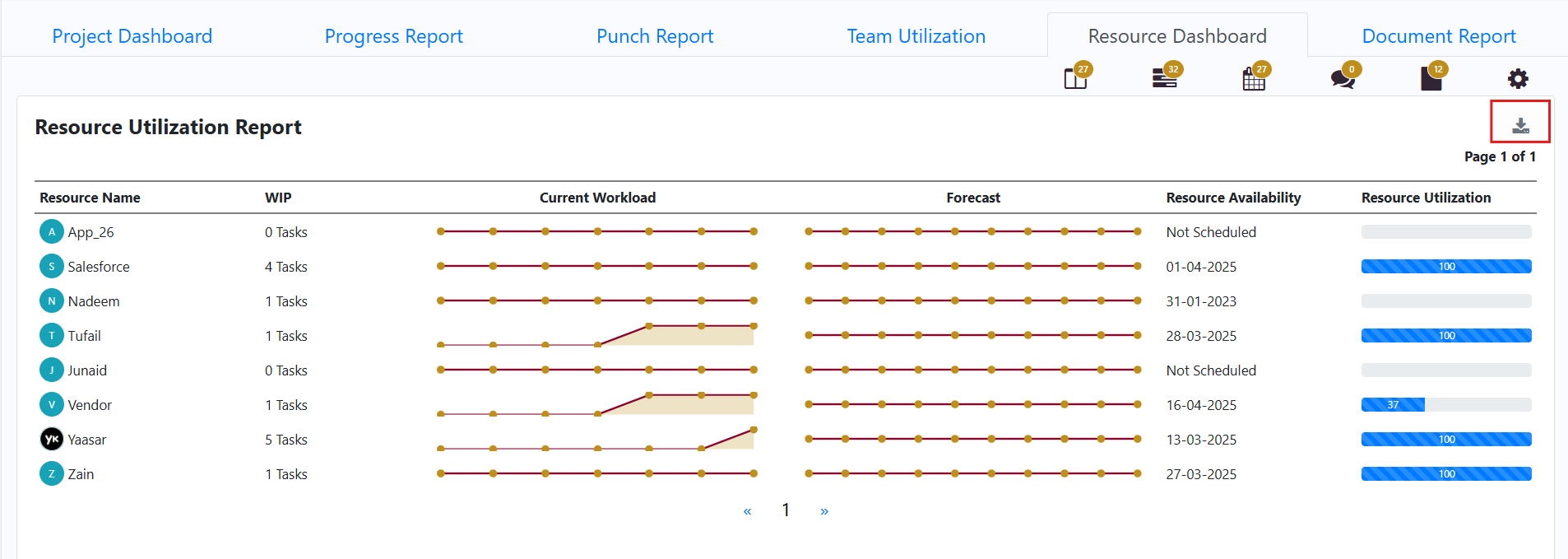
Step 3: Resource Utilization Report is the first section you will see in the Resource Dashboard, which displays key metrics for all users in the project. This includes the Resource Name (user), Number of Tasks (WIP), Current Workload, Forecasted Workload, Availability Date, and Utilization Percentage Bar. This gives an overall view of how resources are allocated
Step 4: The Resource Utilization Report can be downloaded and printed to PDF format by clicking the Download Icon.
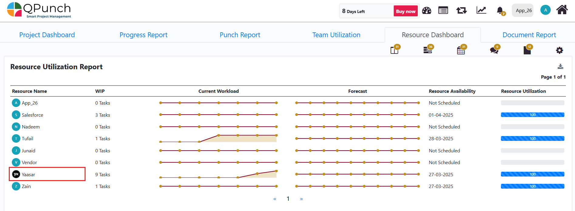
Step 5: To view a specific user’s Time sheet/Overall utilization in the project, click on their profile from the Resource Utilization Report.
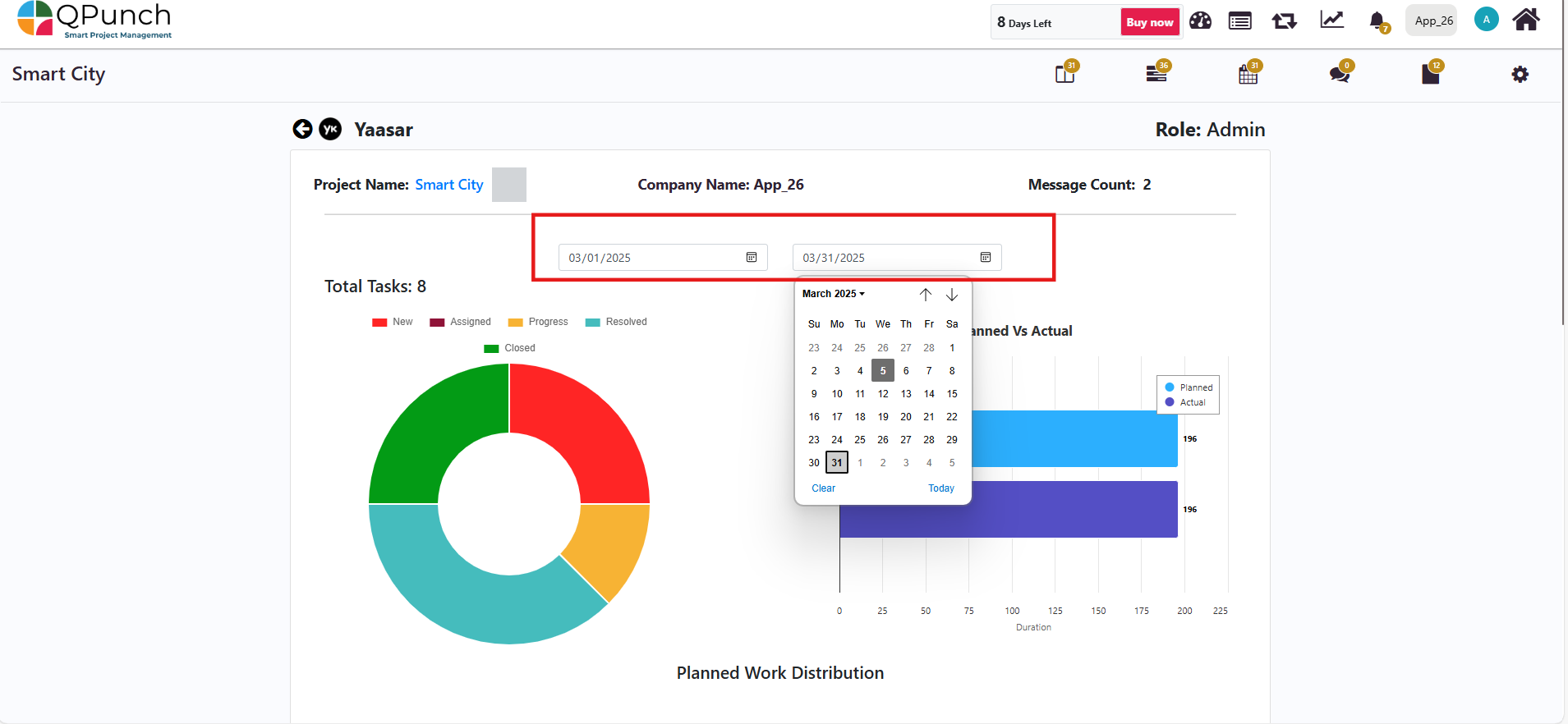
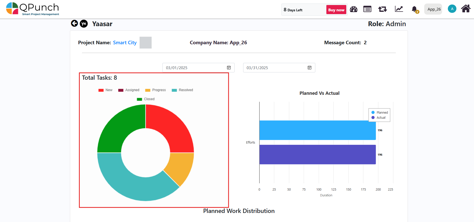
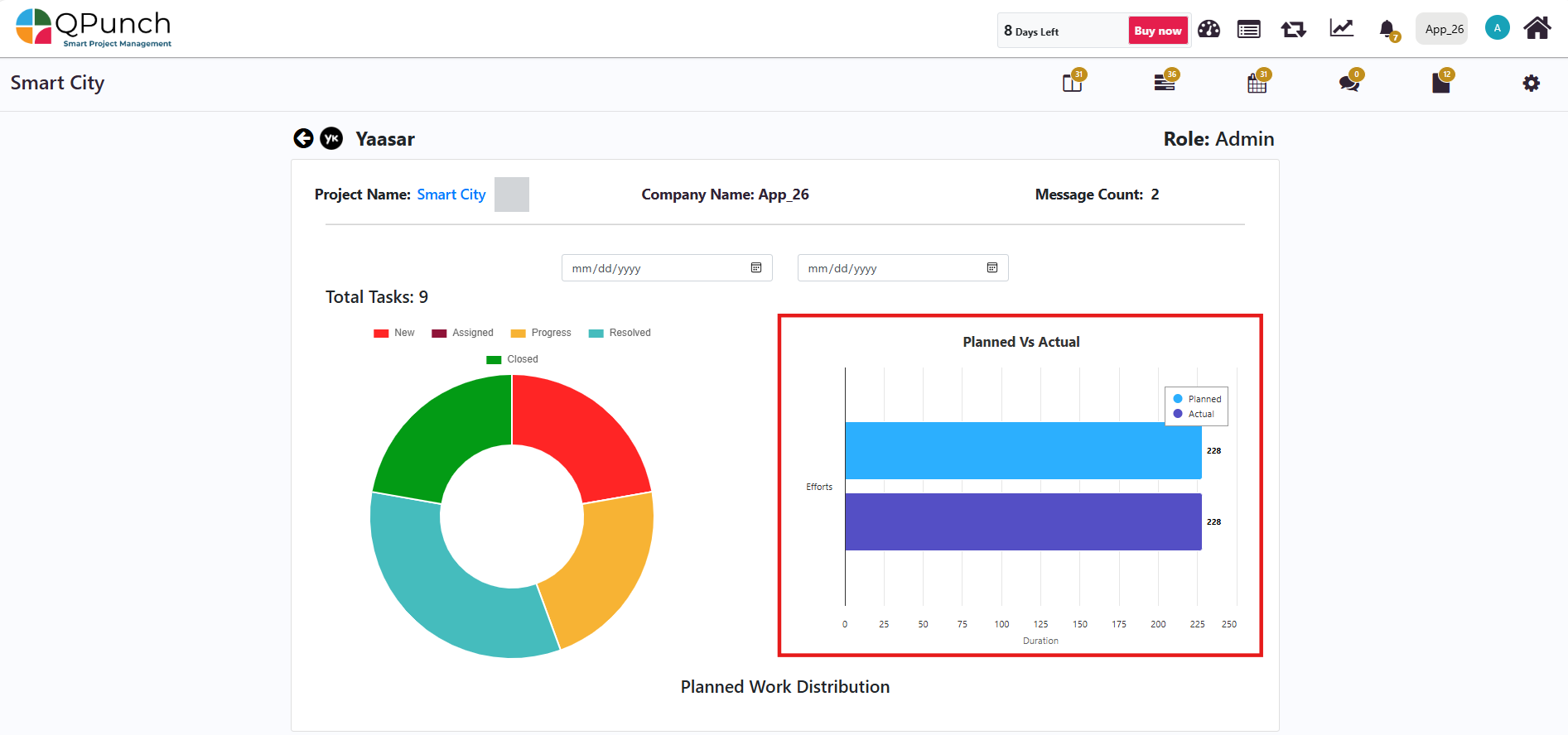
Step 6: You can edit the start and end dates of the Resource Utilization Report of the user and the dashboard will update to show key insights of that user like task statuses.
At the top, you will see the total number of assigned tasks. Below that, a donut chart displays the breakdown of task statuses (New, Assigned, In Progress, Under Review, and Closed).
And, next to the donut chart a bar graph compares planned vs. actual efforts for the selected duration.
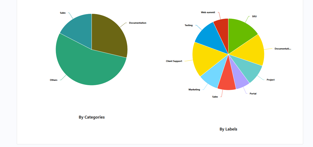
Below the utilization details, you will find the Planned Work Distribution section. This contains two pie charts that show how tasks are categorized by type and label.
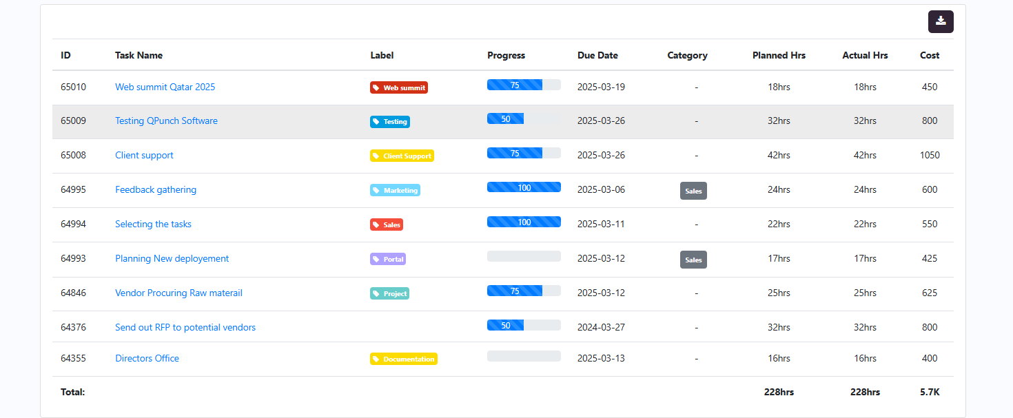
Below the Planned Work Distribution section there is also a tabular format. Which shows the details for each assigned task, including Task ID, Name, Label, Category, Progress, Due Date, Planned Hours, Actual Hours, and Task Cost.
Return to the Resource Dashboard section to see an overview of the entire project.
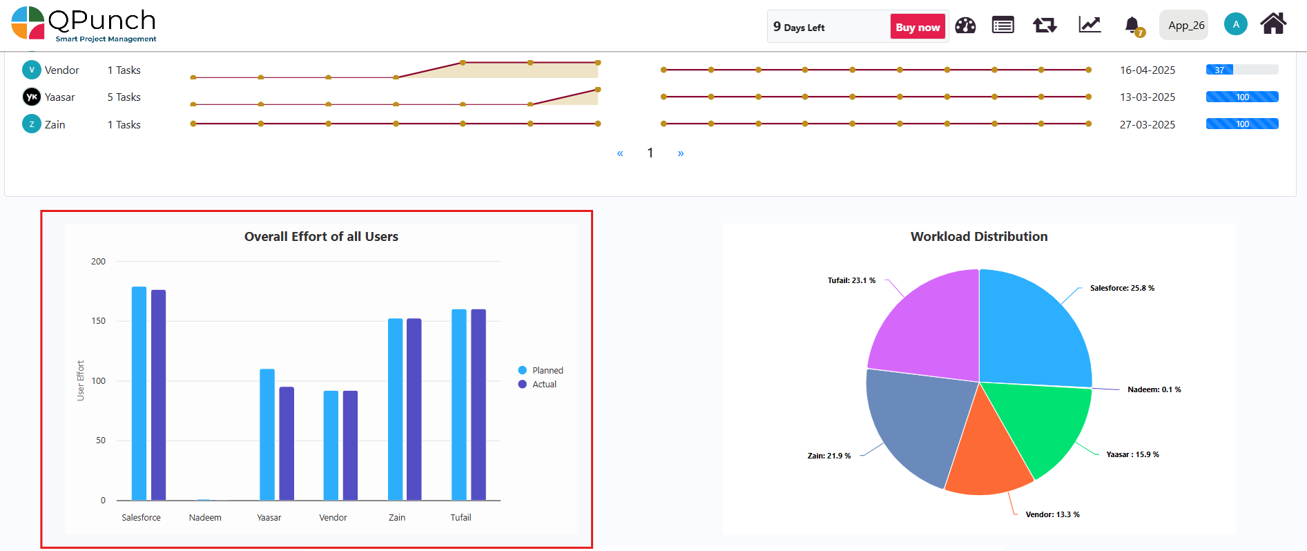
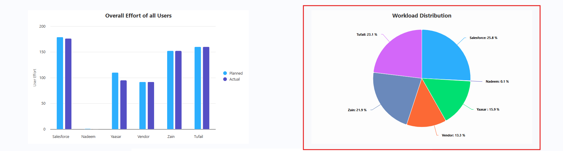
Step 7: Below the Resource Utilization Report, there are two important graphs:
Overall Effort Graph – Shows the total planned vs. actual hours for all users.
Workload Distribution Chart – Displays workload distribution across users in percentage form using a pie chart.
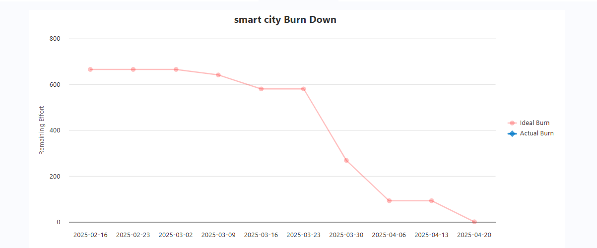
At the bottom of the Resource Dashboard, you will find the Burndown Chart, which visually tracks the project’s progress. It compares the ideal burndown rate (expected progress) with the actual burndown to help identify if the project is on track.
Conclusion: The Resource Utilization Dashboard in QPunch ensures teams are effectively allocated and workloads are balanced. By following these steps, managers can gain better insights, improve resource efficiency, and optimize project performance. For further assistance, feel free to contact the QPunch Support Team.